How I Make Comics: On Drawing "Let's Talk, Father-to-Father"
A deep-dive of turning a Discord thread into a 13-paged comic
27 April 2025
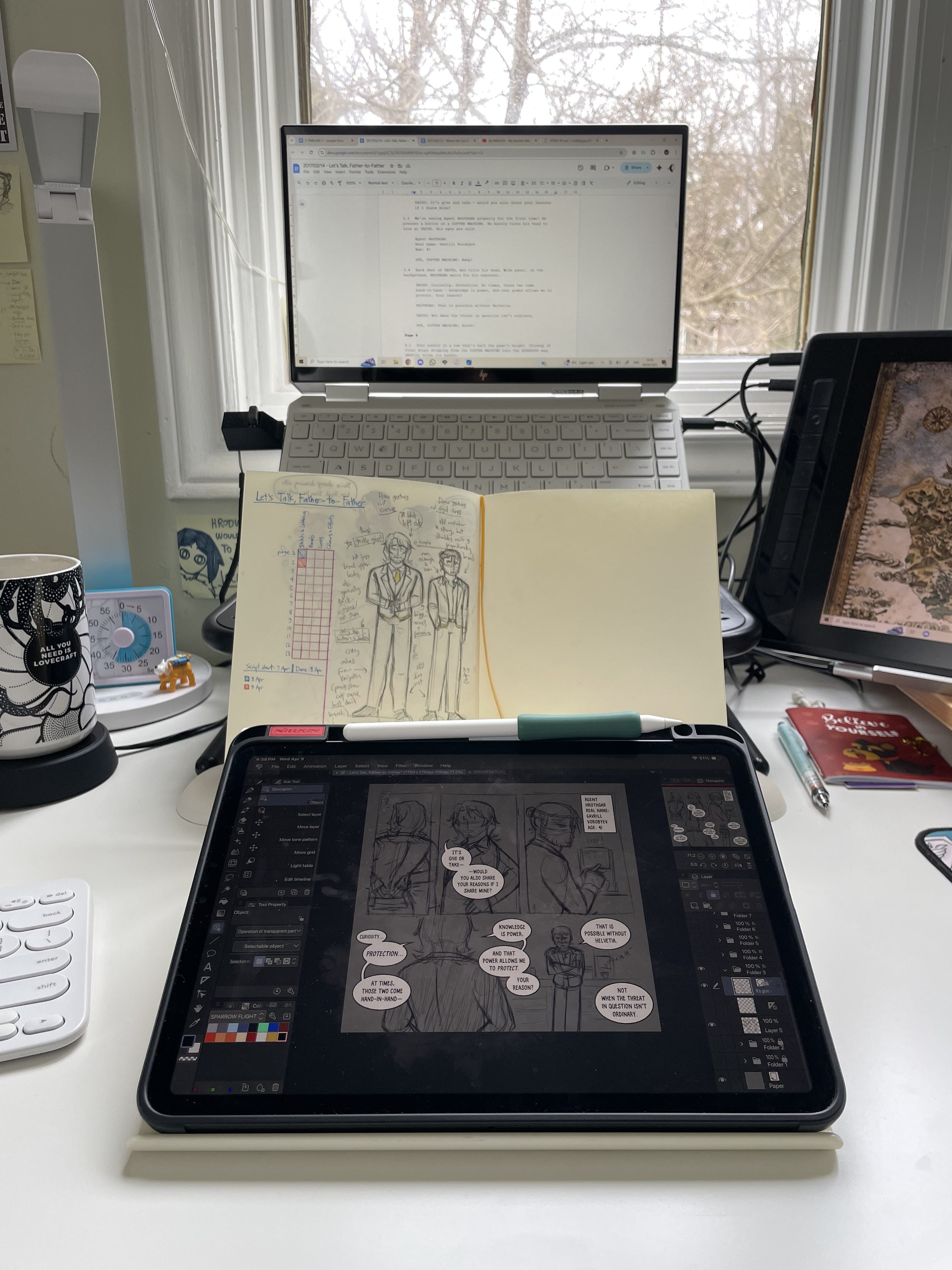
My setup during the Sketching phase
I'm no expert at making comics, but I'm finally finding my rhythm with making then on my iPad. So, here is my current full process of turning a Discord thread into a comic! This is going to be a very lengthy post about making "Let's Talk, Father-to-Father" and all the things I learned on the way. If you haven't read it, you should get to that first before reading the rest of this. It’s only 13 pages long!
The Process:
- Scriptwriting
- Visual Development
- Sketching and Lettering (the comic's script and sketches are here!)
- Panelling
- Inking
- Colours and Effects
1. Scriptwriting
Like I said about, this comic was originally a Discord thread. The reason for that is because this comic, and all other Sparrow Flight short stories and comics, are based off a TTRPG campaign I’m in (Delta Green: The Roleplaying Game to be precise). When we’re not having our usual voice sessions, we sometimes take our characters and our stories to text.
Sometimes, these text-based open roleplaying are done solo (I treat them like short stories that eventually get published to Sparrow Flight). Sometimes, these are done with other people, such as the one this comic was based off of:
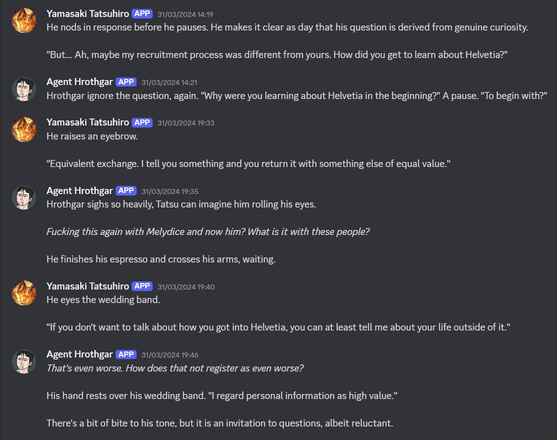
A snippet of the comic’s source. We use the bot ‘Tupperbox’ to type as our characters.
I begin scripting by copy-pasting messages into a blank Google doc. What I’m primarily keeping in mind is pacing and information. The unstructured, improvised nature of open roleplay sessions, though fun to read back on, doesn’t make for the best story. Sessions tend to meander around before actually getting to the meat of what I want to feature in the comic. There are fun dialogue and details I need to cut out to keep the pacing tight. As a result, some information about the characters, the overall context, and/or the setting are stripped away, too. I make sure to only include what’s relavent to the characters: what I want the readers to know about them now, and what I want to build on top off in the future.
This was so far the most challenging session to distill. Compared to the other 2 comics I wrote myself, not only did this session simply have more content, but it had no real plot except dialogue. The first comic is about Gavrill and his eldest child, Hrodwyn, awkwardly trying to bridge the gap between them. The second comic is about Gavrill going to a pharmacy store with his middle son, Merethel, who has another reason for coming along. But this comic is simply two guys talking to each other.
You can argue that the plot is either character trying to get information out of the other through different means, but it doesn’t change how the information is conveyed only through dialogue. With the other two comics, the characters had to interact with props and move through the setting. But for this comic, if Gavrill and Tatsu were sitting at a cafe table the entire time, not much would change.
So, what’s the problem with a comic being entirely focused on dialogue? There are two main ones in my head:
-
Dialogue is inefficient for conveying information. This is a writing problem that constantly lurks at the back of my mind, because I’m primarily a short-story writer. Exposition is a much faster way of getting information across. For example, telling the reader about the lovely weather through two characters talking may take more words, and/or may feel slower, than simply stating “It was a sunny day, and the smell of roses drifted with the spring breeze”.
-
The talking-head problem. This is a drawing problem. If nothing is happening in comics except for dialogue, it’s very easy to fall into the pattern of using the same head angles and the same compositions that makes the comic just a bunch of identically-shot talking heads, which doesn’t make the comic look visually interesting and engaging.
The first issue was mostly resolved in the copy-pasting phase where I filtered out irrelavent dialogue and details. What’s left in the script is all that’s needed to convey the characters and to keep the story moving. But since the second issue concerns itself with drawing rather than words, I solved it through… writing the script, too!
Whenever I write short stories, I tend to strongly visualise the scene and actions before putting them down on paper. This is no different for comic scripts. I’ll imagine how the page is laid out and what the scenes within the panels look like before I organise copy-pasted mess into pages, and then into panels. And because I’m the only one working on this comic, I can be as detailed as I want to be with the script!
This is why I can get pretty precise with describing panels in my script. I’ll worry about how I’m going to arrange the page now, and worry about how I’m actually going to execute it later. It reduces my brainpower for the sketching phase, and boy will I need all the brainpower I can get in that phase.
I know most cartoonists execute layout through thumbnail sketches. The reason I don’t do that (for Sparrow Flight comics, at least) is because it’s simply faster for me to write, move, and delete text than it is for me to erase and redraw bits of a thumbnail (or a new one entirely). I also know that whenever I look at my written description of a page layout, I can recall exactly what I had in my mind when I wrote that (well, most times…). This may have evolved from writing stories, where I turn outlines or rough notes into prose, or from programming, where I turn pseudocode into actual code. As a bonus, writing my layout spares my stiff wrists and neck from drawing more things!
Last but not least, I’ll be remiss to not mention my friend Mint, who ‘played’/wrote Tatsu in the original session, and who also came up with Tatsu’s character. It was very important to me to be as faithful to what Mint wrote as possible in both Tatsu’s dialogue you see in the comic, and his actions written out in the script. Besides cutting out segments entirely, the only changes I made to what Mint wrote was cutting out a word or two to fit the page (though I think I mostly did this with Gavrill, who’s like being efficient with his words, anyway).
Phew! Now that the most brain-draining phase is out of the way, let’s get to actually drawing!…
2. Visual Development
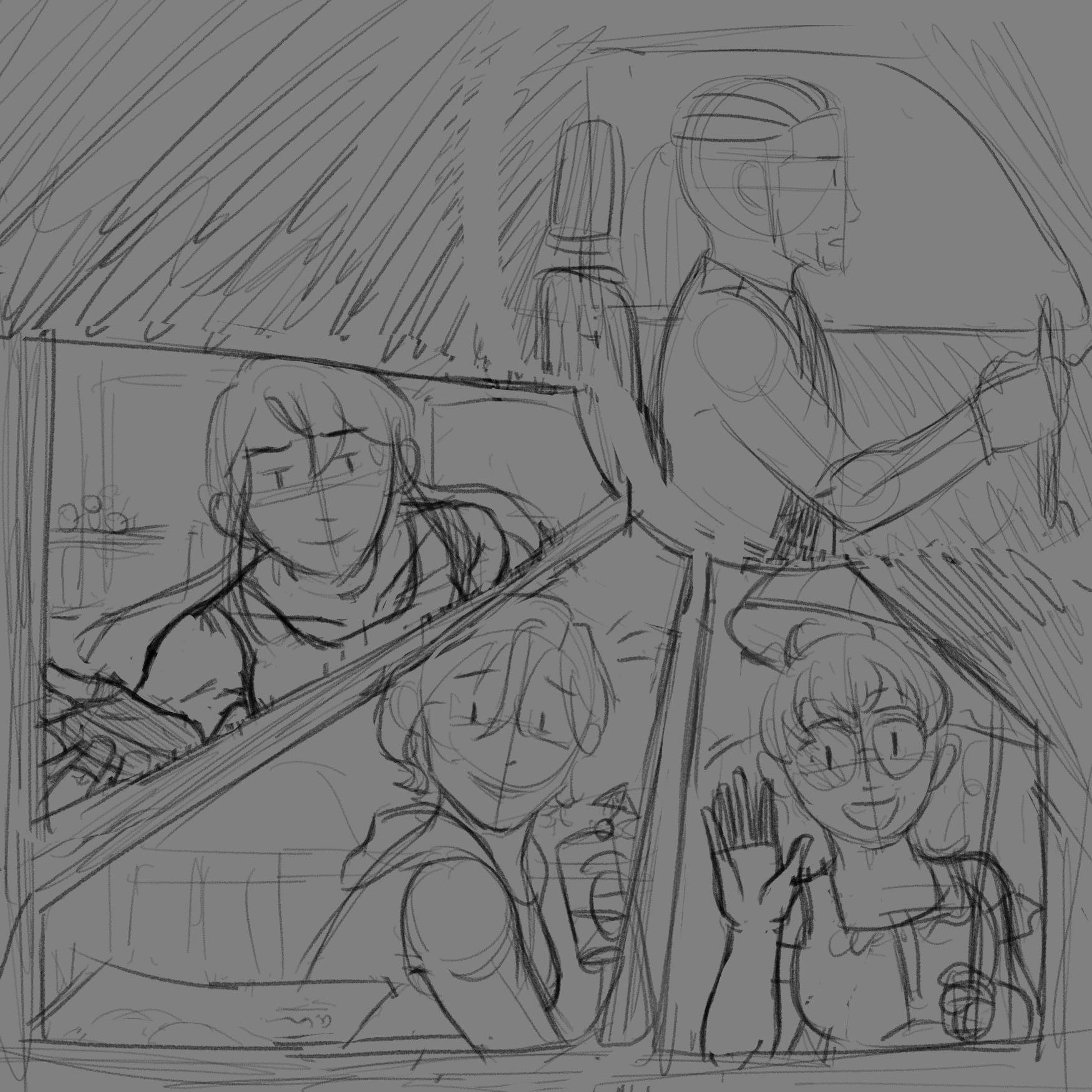
…Or so I thought. I forgot about how I have no idea what the setting of the comic looks like, and how I have never drawn Tatsu below his chest. Fortunately, the script tells me all I need for the setting, including props that need to exist to be interacted with. So, I sketched this out quickly:
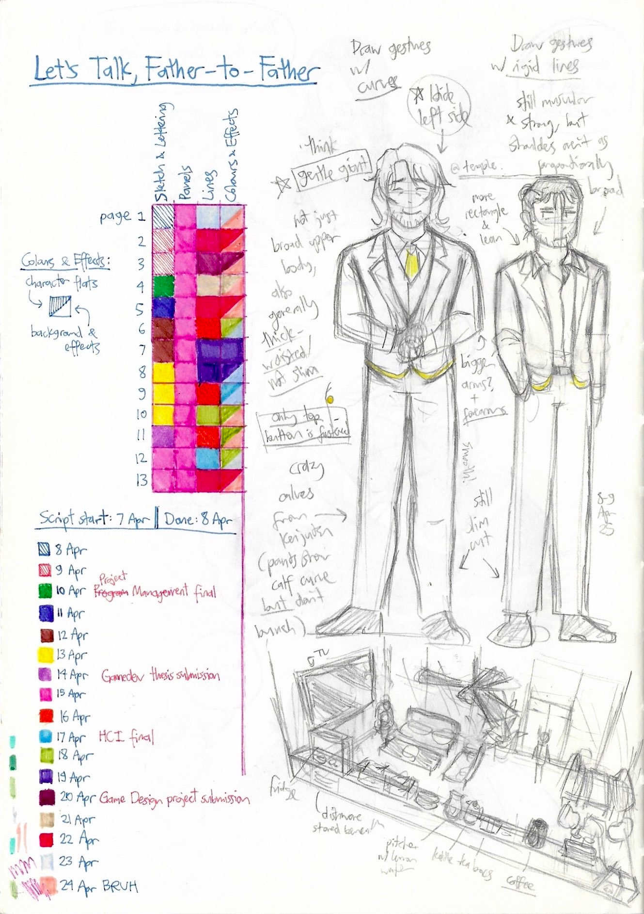
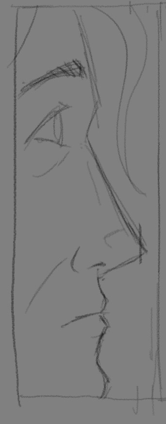
A page from my sketchbook, a Midori A5 notebook. If you use Tombows/water-based markers to draw, I recommend Midori’s paper!
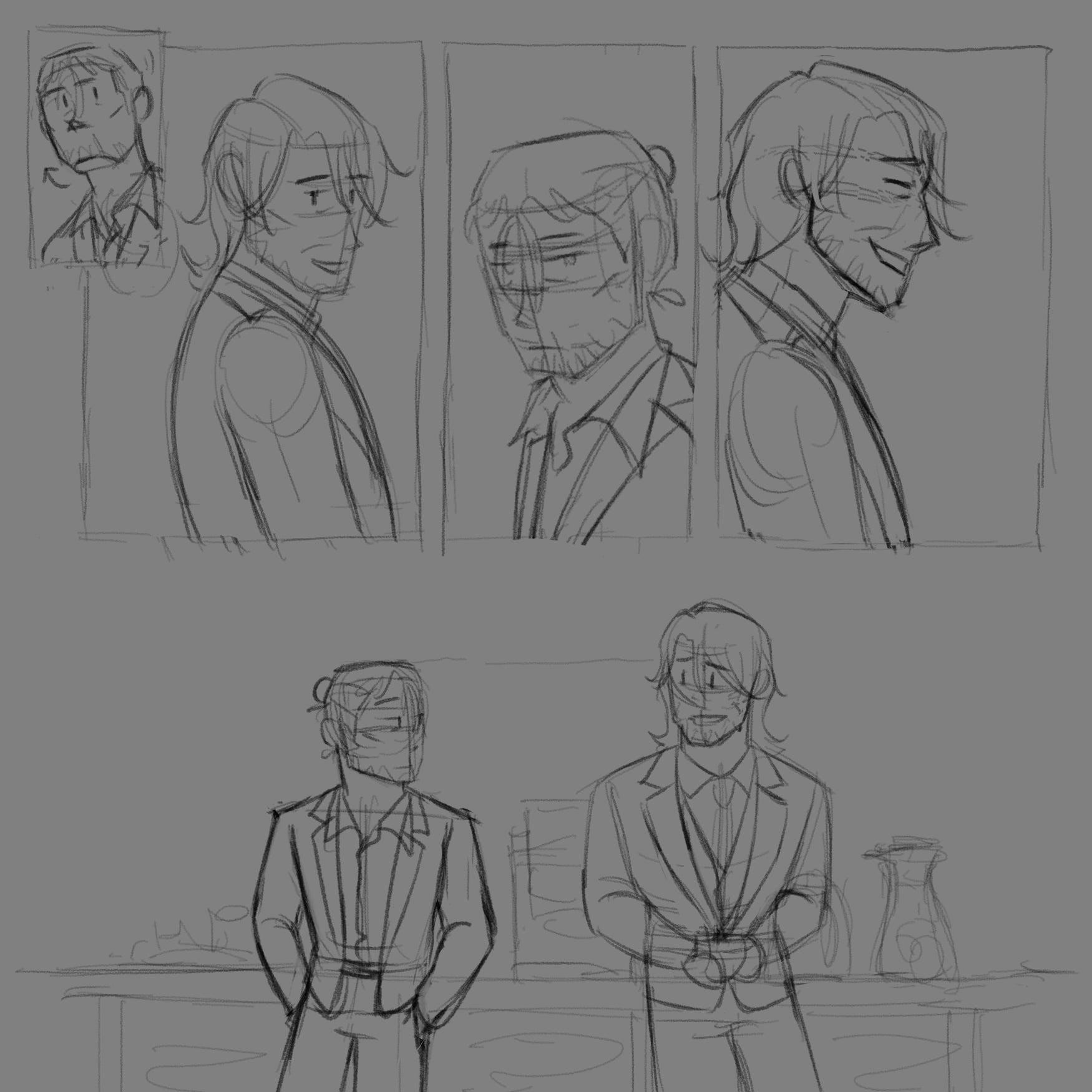
Though I did need a guide for what Tatsu looks like, what was more important to me was to see the differences between Tatsu and Gavrill. Though lean, Gavrill still is muscular, strong, and pretty tall (both men have 17 Strength in-game). It’s just that Tatsu is ridiculously big. With this guide in front of me as I sketch (as per the first image), I can remember to draw them differently. (A funny story: I realised that these two were still too slim in these sketches, so I scaled them up in the comic. But this guide was still useful, because the ratio of their shoulder lengths are still the same.)
At the same time, I can make sure I can be consistent with how I draw these two. I can make sure I don’t accidentally make Tatsu leaner, since drawing Gavrill’s leaner frame is embedded in my muscle memory. At the same time, the guide reminds me that Gavrill should be more muscular than how I draw him in this simpler, stripped-down, comic style! It’s a tiny detail, but you can see it in how I draw his neck thicker compared to previous comics.
 |
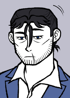 |
Lost at Shoppers" vs "Let's Talk, Father-to-Father". It's subtle, but if you remove his scarf, you can see the difference. Gavrill also looks very different off/on duty, which is also why I needed to draw my guide!
I also need to draw these two in uniforms I rarely draw. Fortunately, I have a reference for this uniform as my Game Master (the one who runs our Delta Green campaign) commissioned me to draw it. I did simplify though, it so my hand wouldn’t die (just like how Tatsu’s meant to have the dark roots of his hair visible, but I knew I’d drive myself crazy trying to make them look just right).
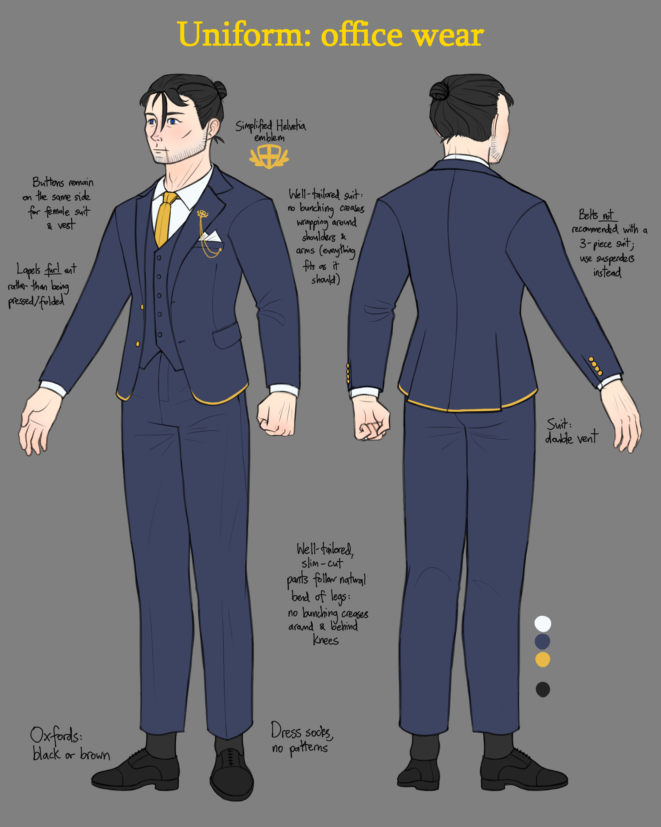
The original, complete uniform. I changed its colour to fit Sparrow Flight’s limited colour pallete. It’s now weird seeing how dark it originally is!
When designing this comic’s setting (an office lounge), I made sure that I included all the props that were included in the original session (eg: Tatsu’s corner chair) and that will be featured more in the comic (eg: the coffee machine). I also tried to design the lounge to fit the organisation the campaign is set in: a ridiculously bougie secret organisation that regularly sends its agents to kill cosmic horrors, or die.
I figured that such an organisation would want its lounge to not only be fun and relaxing (with a ridiculously sized television and having fancy lemon water instead of normal water), but to also try to get its agents to socialise with each other. It’s important to try to remember your and others’ humanity in this line of work! That’s why nearly all the seating are arranged to accommodate big groups, and that’s why they all face each other (no sitting alone with the horrors in your head!).
I wanted to incorperate more of the lounge’s location into its design (Rio, Brasil) with decorations. Unfortunately, I wasn’t able to do this since I was running out of time.
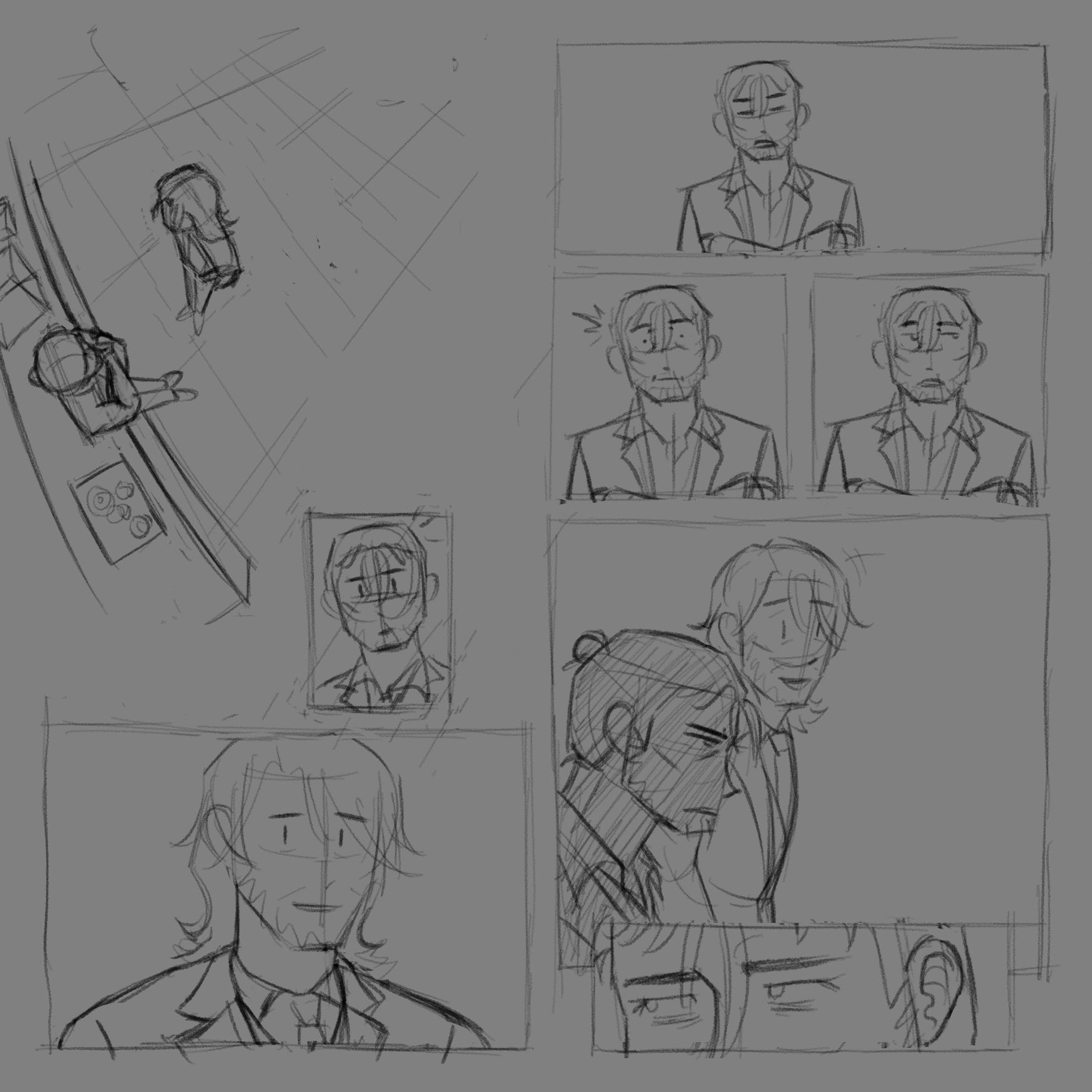
Speaking of running out of time, it’s time to address that chart on the left! It was to track how long each comic phase took. I thought it’ll be fun and motivating to fill up the square one by one. It had the opposite effect for the first week: it was terrifying to see all the blank squares I aimed to fill in about 2 weeks. Nonetheless, it ended up being informative: I could better predict how much work I can get done. This carries to future comics, where I can also predict how long each phase will take me.
Unfortunately, my scanner made some colours look similar to each other, but I think my progress is otherwise visible enough. As for the notes beside the dates… I drew this in my last semester of my Compuer Science program at university during exam season, because I was very stubborn about sticking to Sparrow Flight’s weekly schedule.
I failed! I was a bit disappointed over that, but I was more glad that I finished the comic (and proud that I did that while studying for 2 exams and finishing up a group-project simulaiton and video game).
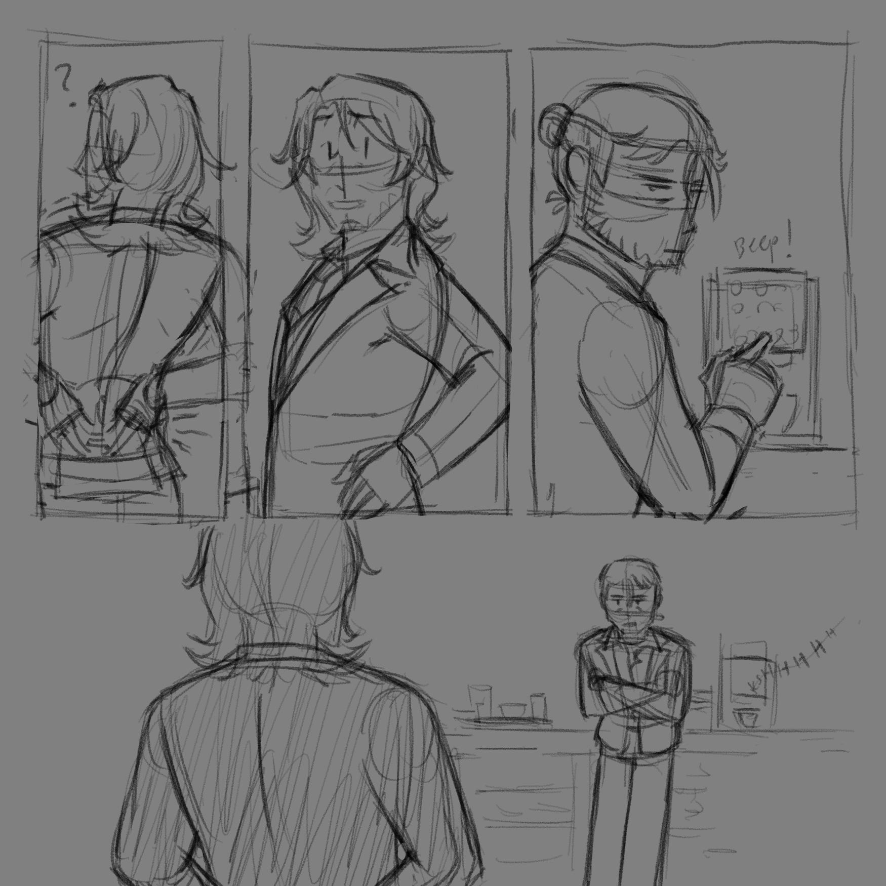
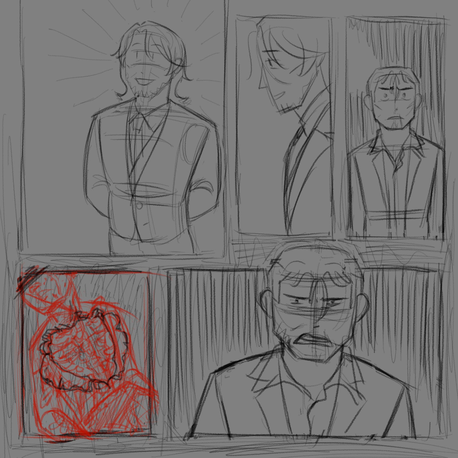
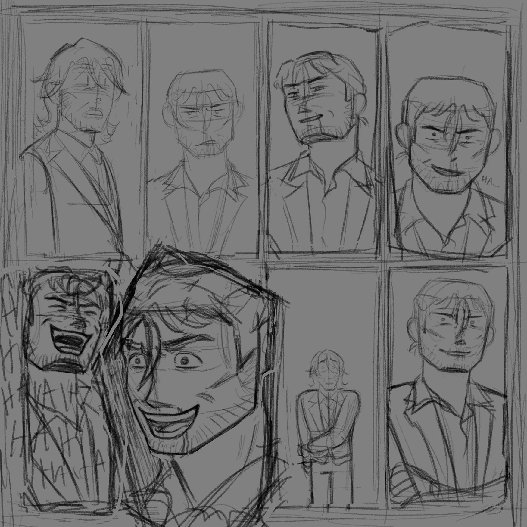
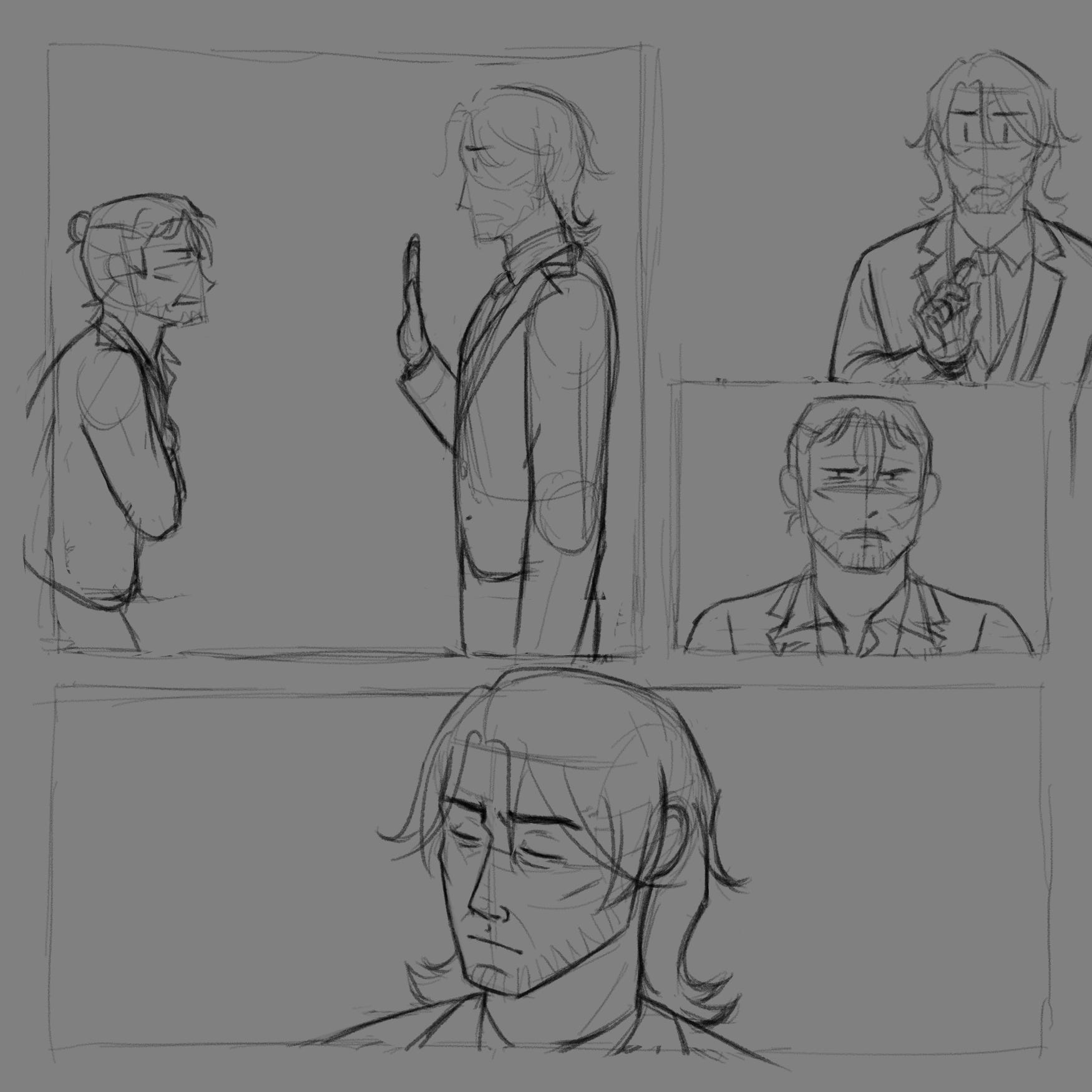
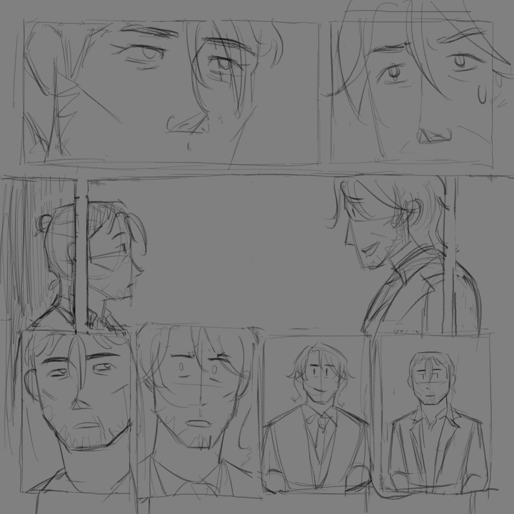
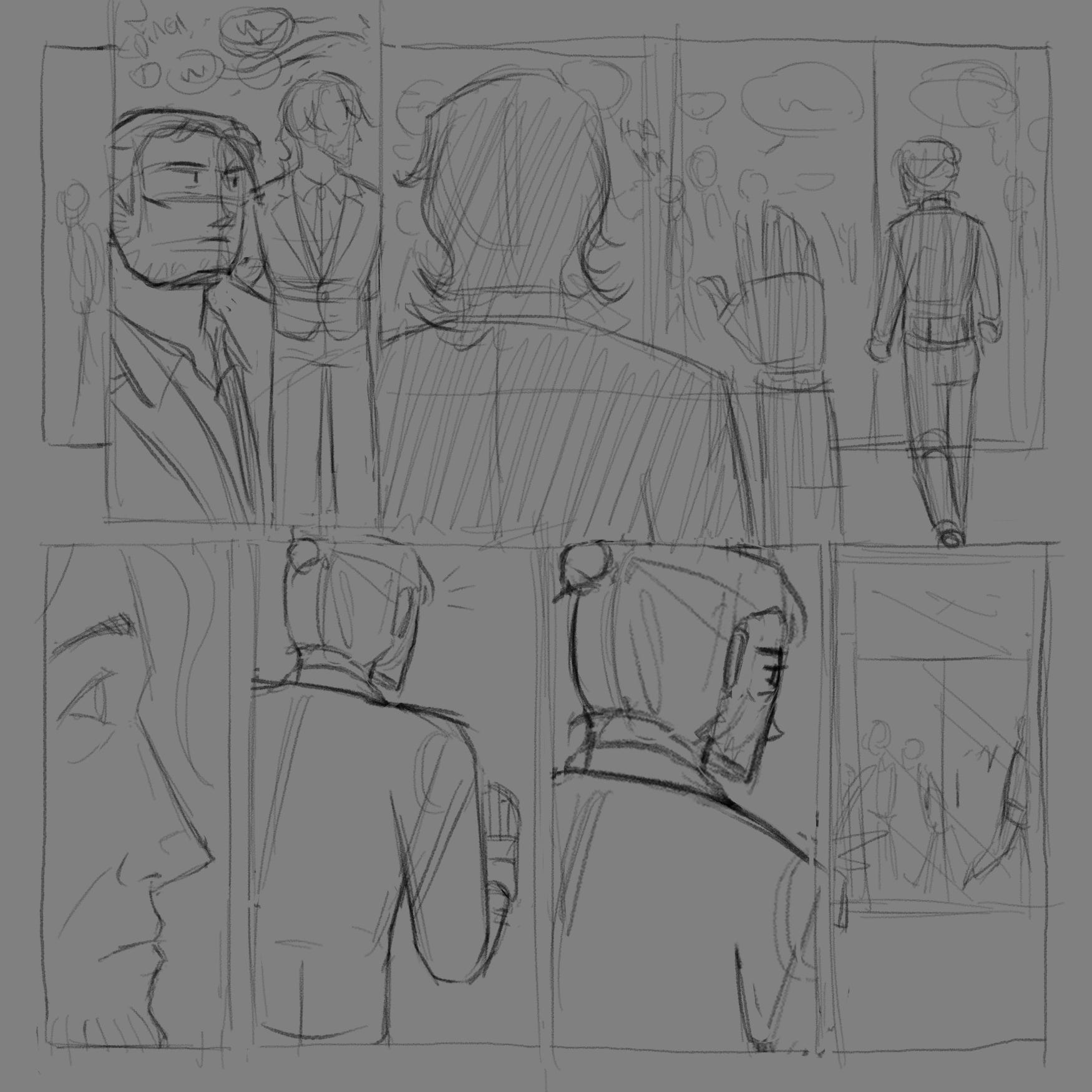
3. Sketching and Lettering
Now let’s finally start drawing for real this time! Since everything was premediated in the script, all I had to do was follow it. As the chart above shows, I sketched the pages chronologically.
There are some instances where the script’s layout doesn’t match the sketch at all. This comes from me changing the script while sketching, because actually drawing reveals ideas or problems text conceals. Usually, I’ll make sure that the script is consistent with the sketch. But at some point, I gave up. There was that one page in the script where I had no idea what I was talking about with the panneling. And later down the road, I got too tired to change the script.
For each page, I sketch and do my lettering (placing speech bubbles) before moving on to the next page. Lettering was the second biggest headache in making this comic because there’s so much dialogue! It took about an hour for each page. I also wanted to keep my pages to a minimum so I won’t have to draw too much. That meant cramming as much dialogue into a page as possible while still keeping things readable and visible. (I personally also prefer my pages looking denser like European comics, aka having more panels and sometimes bubbles per page.)
I did go overboard with some pages to a hilariously and embarrassingly ridiculous degree. There’s one page that should’ve been two pages, and it wouldn’t need much extra effort to do that. However, the same can’t be said about another page: splitting it up would mean laying out a whole new page, which means taking up more time in thinking it up and drawing it out. That said, I’ll make sure to let my art and panels have more breathing room next time.
With that said, here are my sketched pages (without lettering) and their corresponding script! My script’s format came from me reading Zdarsky’s Daredevil script and going “I’m stealing that”. I don’t know how it actually works, but I know how to space my text and to capitalise characters, settings, and important props!
Page 1
1.1 This whole page is made of pizza slices with FISHER at the top right. First slice is blank. Narration runs from left to right.
HROTHGAR (off, thought): When Fisher picked me up for Operation STATIC SHOCK, he told me he read my files. Even the parts that Helvetia’s black ink didn’t want him to see.
1.2 Narration leads to FISHER’s profile as he drives. Show the car window behind his head?
HROTHGAR (off, thought): He also read the rest of the team’s files. Well, most of theirs. He said:
1.3 Keep FISHER’s bubbles close to him, the ‘centre of the pizza’. This slice features MELYDICE with MMA gloves, from when she was sparring with HROTHGAR. Sweat beads from her triumphant face. She offers a hand to HROTHGAR, whose perspective is the camera.
Agent MELYDICE
Real name: unknown
Age: 30
FISHER: Melydice and Muerte are competent at their jobs. Confirmed.
1.4 Next is AMAIA, with a sweet smile and watery eyes, at a beach bar. From HROTHGAR’s perspective, he hands her his watercolour painting of a hedgehog and a black cat nestled against each other. Its thin, broken lines give an illusion of softness. At the bottom is the date 13 FEB 2017, ‘Valentine’s Day’, and his signature: ‘G. V…’, where a mess scrawl trails after the V.
Agent AMAIA
Real name: Amaia
Age: 32
1.5 Now it’s YONA on a sunny Rio day. She's donning a pair of round sunglasses, a pastel pink sundress, and a white parasol. She stands out from the crowd.
Agent YONA
Real name: Yona
Age: 31
FISHER: The other two are brand new. Intel on Yona says she should be fine. But I have nothing, not even black ink, on…
Page 2
2.1 Big vertical panel, manga style. Just draw a line down the page and call it a border. We’re in a LOUNGE. Again, from HROTHGAR’s perspective, we see TATSU smiling warmly. He’s in a corner chair, playing Ensemble Stars on his phone with the volume at full blast. A forgotten cup of coffee sits on a low table in front of him. TATSU is wearing Helvetia’s three-piece suit and black gloves.
Agent TATSU
Real name: Tatsuhiro
Age: 53
TATSU: Good morning.
SFX, TATSU’S phone: Music notes
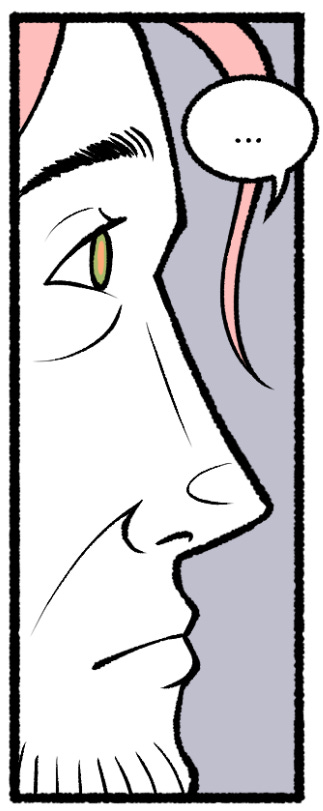
2.1 Short bordered panel. Closeup of HROTHGAR’s face. There’s a door behind him that frames his face. He does not trust TATSU.
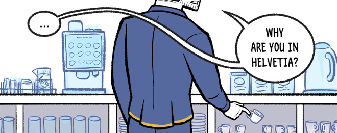
2.2 Borderless establishing shot of the LOUNGE that bleeds into the gutters, Minna Sundberg style. Top down??? The LOUNGE is very bougie, like an airport lounge. It even has a mini fridge and a snack bar on a COUNTER. At the edge of it is a tray for used dishware. HROTHGAR goes to the COFFEE MACHINE to make an ESPRESSO. TATSU stands to stretch. They’re the only people here.
14 FEBRUARY 2017.
Rio de Janeiro, Brazil
Helvetia Branch 4: The Lounge
2.3 Another short bordered panel. HROTHGAR’s in the foreground. So are the cups, mugs, and glasses at this COUNTER. He reaches for an ESPRESSO mug. We only see his mouth and below.
HROTHGAR: …
HROTHGAR: Why are you in Helvetia?
Page 3
3.1 Three, tallish panels in a row. This one’s narrower. TATSU pauses, surprised.
3.2 He cranes his neck to look behind at HROTHGAR and pockets his phone.
TATSU: It's give and take — would you also share your reasons if I share mine?
3.3 We’re seeing Agent HROTHGAR properly for the first time! He presses a button on a COFFEE MACHINE. He barely turns his head to look at TATSU. His eyes are cold.
Agent HROTHGAR
Real name: Gavrill Vorobyev
Age: 41
SFX, COFFEE MACHINE: Beep!
3.4 Back shot of TATSU, who tilts his head. Wide panel. In the background, HROTHGAR waits for his espresso.
TATSU: Curiosity… Protection. At times, those two come hand-in-hand — knowledge is power, and that power allows me to protect. Your reason?
HROTHGAR: That is possible without Helvetia.
TATSU: Not when the threat in question isn’t ordinary.
SFX, COFFEE MACHINE: Ksssh!
Page 4
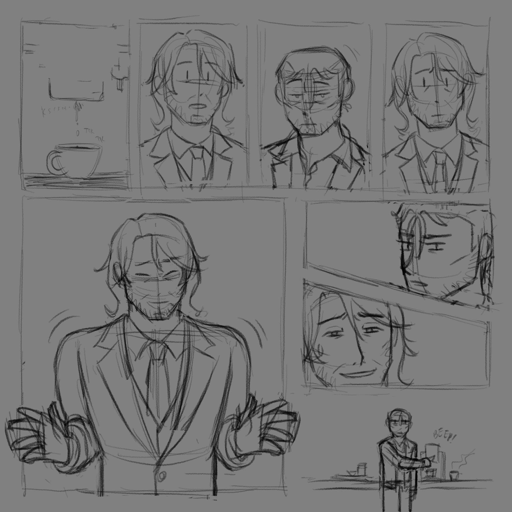
4.1 Four panels in a row that’s half the page’s height. Closeup of final drops dripping from the COFFEE MACHINE into the ESPRESSO mug. GAVRILL holds its handle.
HROTHGAR (off): You know the Unnatural before Helvetia.
4.2 Closeup of TATSU’s face.
TATSU: Is that a statement or a question?
4.3 HROTHGAR raises his eyebrows, expecting TATSU to answer his own question.
4.4 Closeup of TATSU again, brows furrowed.
4.5 Square-ish panel that fills the rest of the page’s height. TATSU shrugs.
TATSU: Before Helvetia? No. I learned about the Unnatural while learning about Helvetia. But… ah, maybe my recruitment process was different from yours. How did you get to learn about Hel—
4.6 Top panel on the right. Closeup of HROTHGAR narrowed eyes looking over his shoulder, untrusting.
HROTHGAR: —Why are you learning about Helvetia?
4.7 Closeup of TATSU’s eyes. He tries to smile but is confused.
TATSU: …Ah, mind being specific?
4.8 A break from the tension. Small, borderless panel. HROTHGAR looks as annoyed and cold as ever. Though his ESPRESSO sits on the COUNTER, he absentmindedly makes another ESPRESSO.
HROTHGAR (thought): I hate English.
Page 5
5.1 Big square panel, 2/3 page height. More zoomed into HROTHGAR. TATSU strains a customer service smile. His back is to us.
HROTHGAR: Why are you learning about Helvetia in the beginning? (pause) To begin with?
TATSU: Um, would you rather we use a translator and a language you're more comfortable with? I might be able to answer the question more clearly if I know what it is you're asking—
HROTHGAR: No. Answer question.
SFX, COFFEE MACHINE: Kshhhh!
5.2 To the right of the previous panel. Closeup of TATSU raising an eyebrow.
TATSU: Equivalent exchange. I tell you something and you return it with something else of equal value.
5.3 Bottom row. HROTHGAR sighs incredibly heavily in annoyance. Bottom-up angle. The COFFEE MACHINE is in view.
HROTHGAR (thought): First Melydice, now him? What’s with these people—
SFX: Tik tik
5.4 Zoom out to show a top-down shot of the two ESPRESSOS on the pantry. He’s surprised.
HROTHGAR (thought): Why are there two espressos?
5.5 Longer panel. Side view of HROTHGAR taking a GLASS from the pantry. TATSU is in the background.
HROTHGAR (thought): …Stupid muscle memory…
TATSU: If you don’t want to talk about how you got into Helvetia…
5.6 Closeup of HROTHGAR’s WEDDING BAND on his left hand holding a GLASS. He pours an ESPRESSO into it.
TATSU (off): you can at least tell me about your life outside of it.
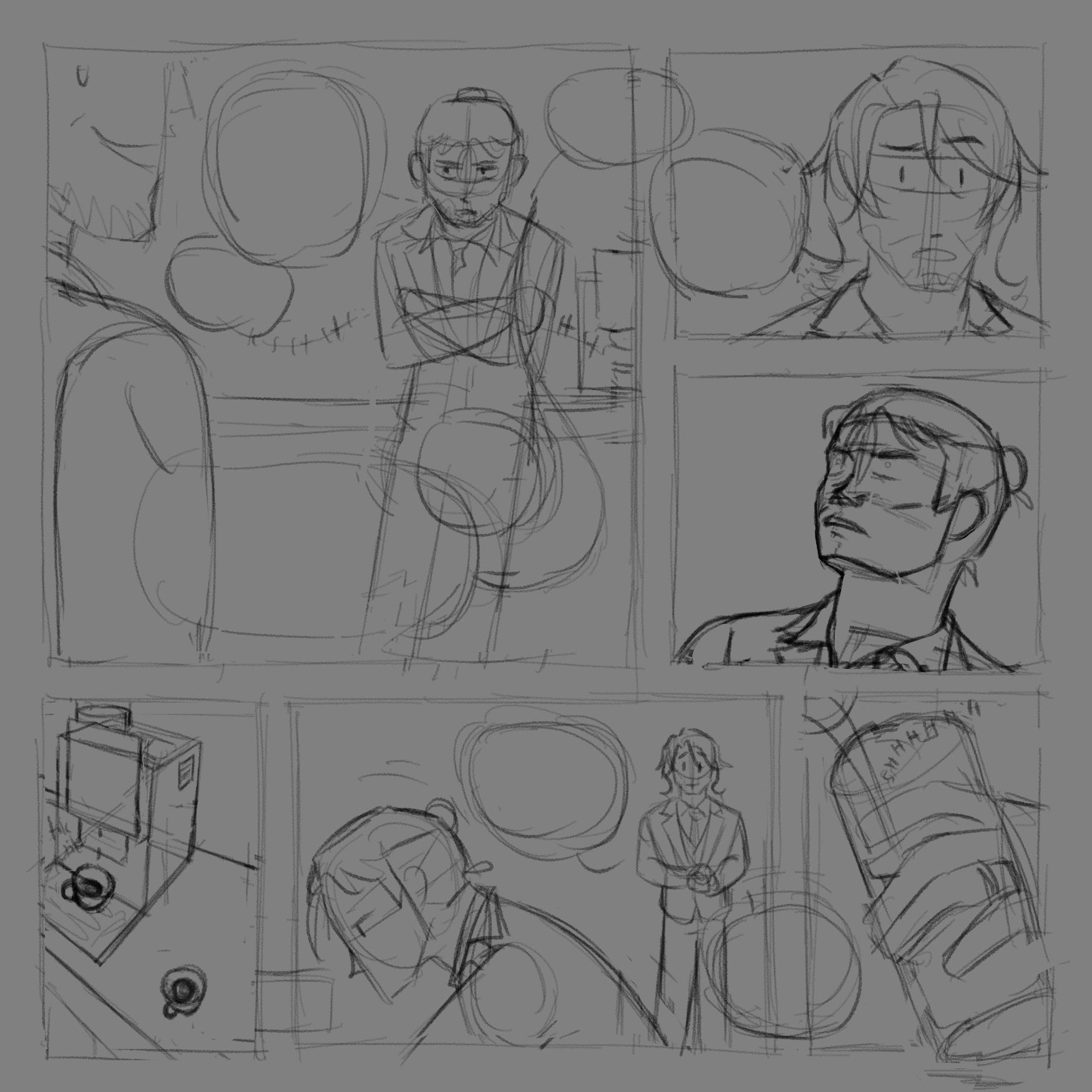
Page 6
6.1 Small panel that’s inside the next. HROTHGAR looks appalled.
HROTHGAR: That information is high value.
6.2 Borderless vertical panel, half the page. HROTHGAR, left, pours the second ESPRESSO into the GLASS and faces TATSU. TATSU, right, paces ‘into’ the page.
TATSU: Then I'll try to exchange information equal to that. Do you have a partner?
HROTHGAR: …Yes.
TATSU: Oh? Where are they now?
6.4 Small panel below the previous. HROTHGAR looks away. He’s holding the glass to his lips with his left hand, so that his WEDDING BAND is visible.
HROTHGAR: …A graveyard.
6.5 Next to the previous panel. TATSU’s surprised. He turns his body to us.
HROTHGAR (off): She passed.
6.6 Borderless. Zoomed out shot, silhouettes. TATSU He looks away sadly. HROTHGAR holds his GLASS still.
TATSU: I’m sorry for your loss.
HROTHGAR: …
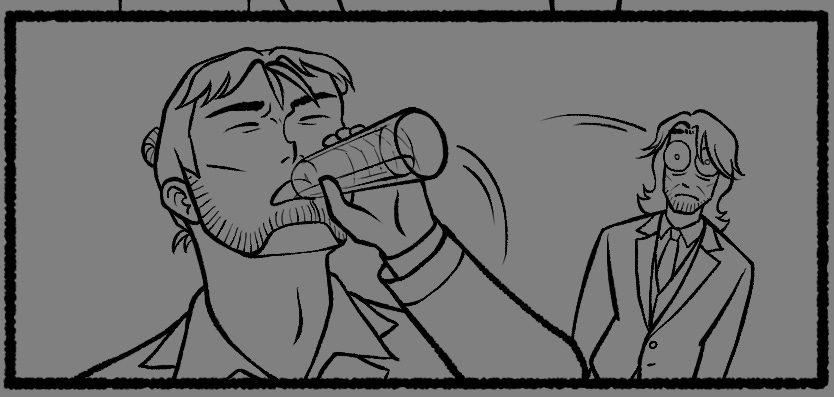
6.7 Short panel. HROTHGAR downs the GLASS as if it’s two shots of vodka. TATSU’s eyes pop.
6.8 HROTHGAR lower his glass. His face hardens again.
HROTHGAR: Your turn. Why are you learning about Helvetia to begin with?
TATSU (off): Another unsatisfying answer: Helvetia walked into my life, and I couldn't refuse.
Warning: the page below contains brief scribbled gore
Page 7
7.1 3 panels this row. This one is biggest with no top border. Zoom into TATSU, smiling a bit heroically. His left hand reaches for his right arm.
HROTHGAR: Explain. Why?
TATSU: I believe in second chances — no one deserves to die. If the chance to protect those who need it comes, I will always take it. Take our latest operation for example. Our targets weren't killed—
7.2 Narrower panel. Side view of TATSU.
TATSU: —they were spared and given an offer to help Helvetia instead.
7.3 Same panel style. Disbelief etches into HROTHGAR’s face.
TATSU (off): That outcome is what I'm hoping to achieve.
7.4 STATIC SHOCK FLASHBACK with noise filter: Teenage McDonalds cashier in the closet. Chest was crudely and messily serrated opened. Heart, lungs, stomach, liver, all gone. Pancreas is still there.
7.5 The disbelief turns into anger. HROTHGAR grits his teeth.
HROTHGAR: You want to save monsters Helvetia will use for weapons.
TATSU (off): Haha, when you put it that way, it does sound bad.
HROTHGAR: Melydice will shoot you for that. Try again.
Page 8
8.1 Panel layout: 2 rows, 4 columns. TATSU fidgets with his right sleeve.
TATSU: I don’t want to save monsters, but people… people brought into Helvetia through similar means.
8.2 HROTHGAR furrows his brow. Every panel is a slow zoom into his face. Their borders also become more unstable and their backgrounds darken.
HROTHGAR: Monstrous people Helvetia hires for killing.
TATSU (off): It still matters that they're people, no matter how monstrous.
8.3 HROTHGAR snorts with contempt. The corner of his lip curls, somewhere between a grin and frown.
HROTHGAR: You choose them over saving people who truly need it?
8.4 Same composition. For the first time, HROTHGAR smiles with barren teeth.
TATSU (off): It makes no difference for me.
HROTHGAR: Ha…
8.5 The panel’s borders are a scar in the page. He starts laughing. It’s unsettling — a hyena laugh.
HROTHGAR: HAHAHAHA!!
8.6 The panel’s instability furthers. HROTHGAR’s bubble burst out of the borders.
HROTHGAR: You see no difference in man who kills child, and child killed by man?! Saving killer is same justice for child's parents?!
8.7 Borderless. A flash on TATSU’s face: he fears for his life. He’s zoomed out, small, and tugs his right sleeve more.
TATSU: That becomes a different case.
8.8 HROTHGAR’s lips grin. His eyes do not. Zoom is now normal.
HROTHGAR: You have right to say which case is good, which case is bad? Must be nice.
Page 9
9.1 Big panel, no border on top, 2/3 page height. Side view of the two men facing each other. HROTHGAR now leans towards TATSU, who raises his right hand.
TATSU: That isn’t what I meant to imply—
HROTHGAR: How did Helvetia find you?
TATSU: *sigh* Back home, I run an agency. It does well enough to support my family, so I suppose Helvetia found me through that.
HROTHGAR: What agency?
TATSU: Does it matter?
HROTHGAR: Yes.
9.2 Top right of page, 1/3 page height. TATSU thinks for a second.
TATSU: Then I'd also like to ask why you're so curious. Is there something about Helvetia that requires you to investigate this much?
9.3 HROTHGAR stops leaning against the pantry. He takes a step forward. Slight top-down?
HROTHGAR: Helvetia knows about everything but you. I do not trust you. What agency?
9.4 New row. TATSU steels himself. Honestly, he looks like a tired dad.
TATSU: *sigh* That’s something I’ll tell you if I can gain your trust another way.
HROTHGAR: Explain.
TATSU: I can’t tell you now.
HROTHGAR: Why?
TATSU: It’s too early to say anything.
HROTHGAR: Tsk.
Page 10
10.1 Big, borderless vertical panel. Half the page’s width? Though clearly unsatisfied, HROTHGAR leans back against the pantry. TATSU stands a short distance away. He’s closer to us, and we see his profile. He looks nostalgic. Neutral composition.
TATSU: But consider yourself informed enough. I really didn't know about Helvetia or their dealings until they came to me.
HROTHGAR: I still have question. You have family?
TATSU: I have children.
10.2 Small panel that overlaps the previous one. Closeup of HROTHGAR. His eyes light up. Let speech bubbles remain in the previous panel: this is just to show HROTHGAR’s reaction.
TATSU: But even if I see them that way, they aren't children anymore.
HROTHGAR: Adults?
10.3 Bordered panel, below the first. We see TATSU’s side. He smiles and nods, nostalgic.
TATSU: Yes. Do you know a thing about that?
HROTHGAR: I do not understand.
TATSU: Having grown up kids. Even kids who grew up too quickly.
10.4 Top of page. HROTHGAR looks down at the floor. His expression is candidly aloof. He plays with his WEDDING BAND.
HROTHGAR: Age matters not. I do not understand being a father still—
10.5 New row. Same shot, except HROTHGAR quickly closes his mouth, eyes wide. Clearly, that slipped out unintentionally.
TATSU (off): Hmm, why is that?
10.6 Same row. HROTHGAR looks up at TATSU, off, with a neutral expression.
HROTHGAR: …It is hard.
10.7 TATSU moves to stand next to HROTHGAR.
TATSU: Hm. Are things going well with your children so far?
HROTHGAR: Not your business.
TATSU: Is it being hard away from them?
10.8 Tiny, long panel that overlaps the previous panel. It’s an extreme closeup of HROTHGAR’s forlorn eyes.
HROTHGAR: …Always.
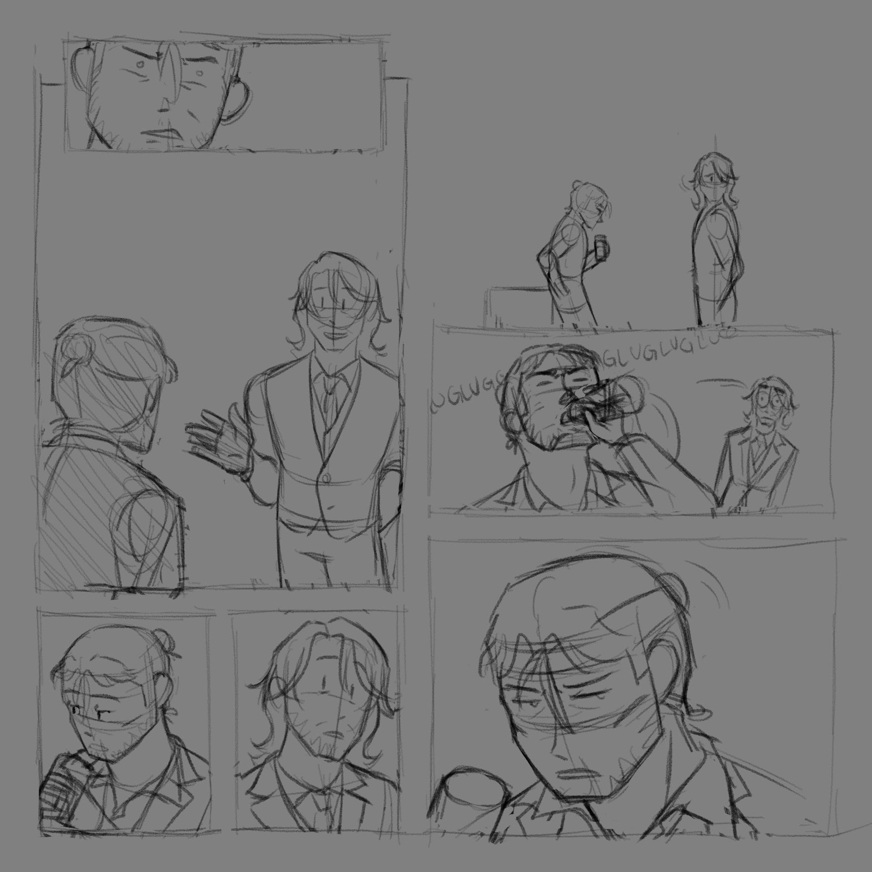
Page 11
11.1 Tiny panel overlapping the next. HROTHGAR nods up at TATSU and raises his eyebrows expectantly, as if saying ‘and you?’.
TATSU (off): Ah, me?
11.2 This panel takes a third of the page’s width. TATSU has a gentle smile.
TATSU: I need to keep reminding myself that they're adults. It doesn't make this any easier.
11.3 Back to HROTHGAR for yet another vulnerable moment. Top-down closeup.
HROTHGAR: …Do you think you are good father?
11.4 TATSU laughs. A bit more zoomed in from last time.
TATSU: Haha! I won't ever call myself one. I can only ever say that I'm trying.
11.5 Bigger, borderless panel that takes up the full width of the page. Both men side-by-side with the background in view. TATSU has a slight grimace. HROTHGAR watches the other man curiously with his hands in his pockets. His face is deadpan, but at least his aggression is gone.
TATSU: Do you share that sentiment?
HROTHGAR: Mm. If mission meets your children, who do you choose?
TATSU: It would ultimately be up to them — I'm here now to make sure they’ll never have to be here.
HROTHGAR: Hm. Let me change sentence.
Page 12
12.1 Long panel. HROTHGAR stares at TATSU intensely. Maybe a closeup of his eyes?
HROTHGAR: If we are on mission but your children stop you from completing it. Who will you choose: completing the mission, or protecting your children?
12.2 TATSU bites his tongue, but there’s no hesitation.
TATSU: Protecting them comes first.
12.3 New row. Very narrow panel. Shot of HROTHGAR narrowing his eyes.
HROTHGAR: Hm.
12.4 Slightly less narrow panel. He lifts his chin, tilts his head slightly, and raises his eyebrows in approval.
HROTHGAR: So I cannot trust you fully on missions.
12.5 Rest of row. Side view with HROTHGAR closer to the camera. He looks ahead while TATSU looks at him.
TATSU: If they decide not to come here, I don't think you'd ever have to worry about that. Ah, is your answer the same, then?
HROTHGAR: Yes.
12.6 New row. 4 panels. Closeup of HROTHGAR.
HROTHGAR: Good parents kill for their children.
12.6 Top row. TATSU’s mouth hangs open. He wants to disagree, but he can’t.
TATSU: …
12.7 He closes it and chuckles.
TATSU: …Glad we can agree on that.
12.8 HROTHGAR finally smiles: small, but genuine.
Page 13
13.1 Bottom-up shot of both men looking up and out of the LOUNGE’s window, alerted by other agents coming to work. HROTHGAR’s smile drops.
SFX: Office chatter, heels clicking, etc
HROTHGAR: That is all question I have.
13.2 Both men’s backs are to us. Through the LOUNGE window, we see a crowd of agents walk by. HROTHGAR begins walking away from the COUNTER. TATSU, still leaning against the COUNTER, waves goodbye.
HROTHGAR: Goodbye.
13.3 Short, narrow panel of an extreme closeup of TATSU’s profile. It overlaps the next panel.
TATSU: …
13.4 Back shot of HROTHGAR, but we can see his face from over his shoulder. He does not look back. He’s stiff.
TATSU (off): I don't know if you'd want to hear this from me. But as a father, you're doing well.
13.5 Same shot, but his grip eases and his shoulders relax. His face softens with weariness.
HROTHGAR (mumbling): …Thank you.
13.6 HROTHGAR slips out the door.
As you may have noticed, some details weren’t shown in the comic (the painting Gavrill handed Amaia, Gavrill playing with his wedding band, Tatsu fidgeting with his right sleeve). Sometimes, there just isn’t space to include those details. Other times, I come up with better poses to convey the story’s mood.
I also sketch everything out on a midtone grey! One reason is so that I can add not just black shadows but also white light to my sketches. I don’t do it here, but I did it in previous comics where balancing light/darks was important to me. But the real reason is so I don’t burn my eyes out, because later stages will do that to me.
4. Panelling
This is the shortest phase I knocked out in a day! When I sketch, all I have is a simple square border to keep the space between panels and the edges of the pages consistent, if I need to. When panelling, I get rid of those to outline the actual panels.
I used Clip Studio Paint to make this comic. Though Clip Studio comes with a panelling tool (as it’s designed for making manga), I prefer using the ruler tool… because I’m too lazy to learn how to use the panelling tool. The ruler tool mimics how I’d use a ruler in real life to draw comics, and I prefer keeping things simple like that. This is also why, in the sketching phase, I freehand my panels without a ruler. Sketching, like scripting, is a whole bunch of problem solving, so I want to be able to draw as quickly and as freely as possible.
This phase is also why the sketch has some ‘cracks’ or distortion. My freehanded panels aren’t going to perfectly fit with my final panels, so I’d simply lasso-tool and move my sketches to make them fit.
5. Inking
This is when I draw the lines for everything. As much as I enjoy inking (especially traditionally), it is also incredibly tedious and is the phase that takes the longest.
I also stop working chronologically. This comic’s a bit of a special case in that regard. Because of my computer science workload, it had been months since I last sat down to properly ink digitally. I wanted to warm up and get used to that first, so I started with the easiest pages to ink that had fewer panels, no backgrounds, and no props. From there, I inked my way to busier pages. I also inked the first page last beause they featured different, and I didn’t want to interrupt my flow of drawing Tatsu and Gavrill over and over again.
I adopted this tactic from Toniko Pantoja, an animator. In an animated project, he mentioned that it’s beneficial to animate a high-action scene first. That way, you’ll get used to drawing the characters. Character inconsistencies that occur from just starting out will also be less noticeable, since everything’s moving fast. But in scenes where the characters are more still, you would’ve drawn them enough times to be able to draw them more consistently! This is a similar mindset I had towards my comic.
However, comics are, in fact, inaniamte and static. I can see how my inking style and the way I drew Gavrill and Tatsu shifted slightly with each page I drew. But it doesn’t bother me: no one will notice them unless they look closely enough, and I find the changes fun to observe.
I did go back to older pages fix some line widths, as earlier pages had slightly thinner lines. I was able to do quickly without actually drawing by using Clip Studio’s vector layers. With those, you’re able to use a tool that changes your lines’ widths, whether it’s a segment of it or the whole line. The vector eraser is also a godsend: you can delete intersecting lines very quickly without having to trim line edges! Lastly, I don’t know if this is true, but I think transformed lines look better. As in, they seem to not pixelate badly due to vectors being based on mathematical formulas. Regardless of if that’s true or not, it’s handy to be able to select individual lines without the lasso tool to move around and transform.
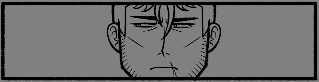
The lines of a panel. I’m still working on top of a midtone grey!
Inking may seem as simple as ‘tracing your sketch’. This isn’t the case for my comics. The intricacies of inking aside (that can be its own lengty post), my sketches are rough! I don’t want to spend more time agnoising over neat, detailed sketches. I just need to get the idea down and move on.
My sketches are largely drawn in my simpler style: dot-eyes and dot-noses that allow for exaggerated expressions. Even though I use guidelines to make sure that these facial features are placed around the right place they need to be, they often don’t translate well into the more detailed style I draw the comics in. And sometimes, the placement of features are outright wrong!
Readers understand that a simpler, more cartoony style is more abstracted from reality, which makes the style much more forgiving of these mistakes. These ‘mistakes’ can even look right or really good! But the more a style resembles reality, the easier it is for readers to find mistakes. We’ve seen people around us all our lives, after all.
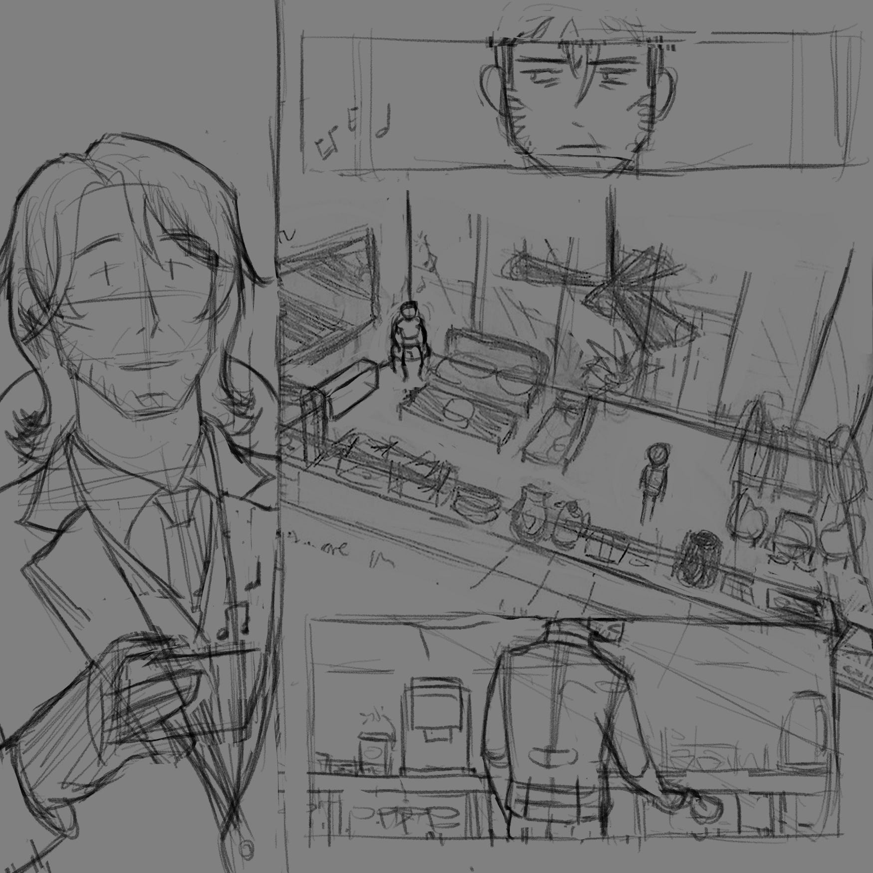
As a result, a chunk of my time inking is spent fixing these mistakes so things don’t look weird. That means I flip my canvas a lot. For example, I found out that the sketch of Gavrill below was skewered by flipping my canvas, so I fixed it. (I also made his face narrower after this screenshot, because it wasn’t on model.)
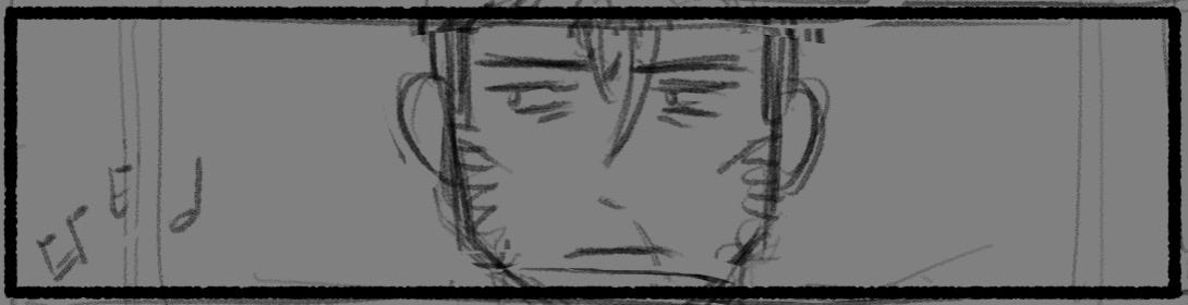
In a sense, I’m almost freehanding these more detailed facial features. And freehanding doodles is how practice this! Freehanding was a weakness of mine for a while, so I worked on it by craking my sketchbook open and going right into it with ink. There’s no undoing or erasing mistakes (except for the occassional whiteout if I really want to clean things up.) And it’s okay if it looks ugly, because the point is to learn and have fun.
Freehand doodles I made after watching Blue Eye Samurai in February 2024. My doodles often end up being silly comics! Drawn with Pentel brush sign pens.
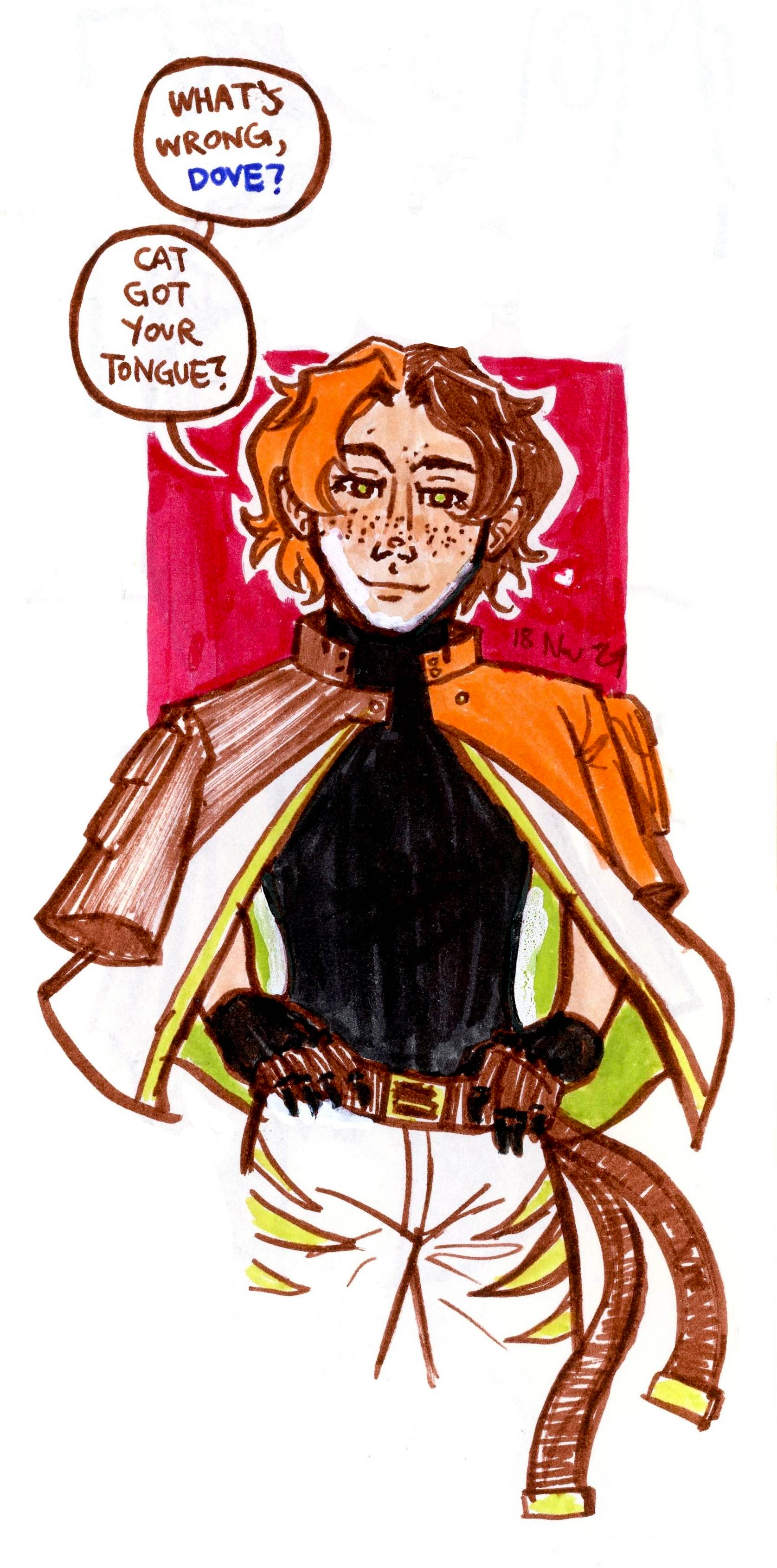
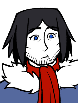
I eventually dared to freehand in my usual, semi-realistic style. This is from November 2024 and is of my friend’s character (Hi, Fish!). Drawn also with Pentel sign brush pens, and then coloured with Tombows dual-brush pens.
In the end, it paid off! I was able to draw more realistic features on top of my simple sketches more easily. And sometimes, I’ll just freehand panels off the bat, like this closeup of Tatsu in my semi-realistic style. I’m still pretty happy with it!
 |
 |
You can also see how my comic style is a more stripped-down version of my usual semi-realistic style.
A quick last thing I want to mention: I continue to tweak the placement of speech bubbles here. Sometimes they form tangents with my lines, and we can’t have that here!
6. Colours and Effects
Even though this was one column in my chart, I really should’ve split it into two: flat colours and everything else.
Flat colours in my process means filling the characters with colours. This is very straightforward: I bucket-tool one colour in, I fill in gaps, and then I do the same with the next colour. This is also when I turn off my midtone-grey layer to start blinding myself with a pure-white canvas!
Like I said before, I have a limited colour palette across the Sparrow Flight comics. This is to make colouring faster and to make the comics look cohesive. I also make certain elements have the same colours to speed things up. For example, Tatsu’s gloves are the same colour as Gavrill’s hair and belt, which are the same colour as their shoes. The two men wearing the same coloured uniform also made this comic a lot faster to colour compared to my previous comic.
I also found myself doing it right after inking to take a break by doing something different and easy… and for a quick dopamine hit. In this time, I also went out with friends since this was our last semester together. When we went somewhere by car, or when we were all just vibing together, I’d pop my iPad open and color in pages, because I can really turn off my brain for this part.
Effects are made up of all those little sound effects and gesture lines. These don’t take long, either. What does take a little longer and more effort are backgrounds!
A trick with comics is that you don’t need to draw backgrounds in every scene. For these moments, I’d fill in the pages with screentones or shades of colour to heighten the story’s current tone. Following the pattern of easiest to hardest, I did these pages first.
But I couldn’t avoid the actual backgrounds and props forever. Not only did I need them to establish where the characters are, but I also needed them for certain shots (like when Gavrill leans against a counter). I decided to paint the backgrounds with the default g-pen at low transparency, because that was how I was used to painting digitally (I reference Minna Sundberg in the script for a reason!), and because painting is much faster than drawing lines.
I did go over my painting with lines because I thought it grounded the background within the comic’s style more, but I was able to keep them loose and messy like the blobs I called paintings. The pipeline was to lower my sketch’s opaacity by a lot, then to paint beneath it, and then to add lines on top.
I properly outlined the counter to ground it in reality more, but did everything else loosely since they’re just background embellishments. I copy-pasted the stuff on the counter SO much in the comic. I love technology.
And that’s it! After 18 days of non-stop work, my comic is done! All that’s left is to post it on its official site, and to yell about it to my friends and on every social media platform I’m on.
If you’ve made it this far, thanks for reading this all the way through! This pipeline of mine is definitely prone to change, as this is only the third comic I’ve made with it. Despite that, I hope that this gave you insight into the bucketload of work that goes behind comics, whether you’re a reader or someone who wants to start making comics. (Maybe it’ll inspire you to not skim through comics quickly, haha!)
I’m by no means a professional artist, but if you’ve got any questions, feel free to leave them below! If you’re a cartoonist yourself, I’d love to hear about your pipeline and any tricks you’ve got up your sleeve.
If you’re interested reading more about Gavrill, his fragile family, and his deadly job, subscribe to it below! Sparrow Flight updates with a new comic or short story every Saturday/Sunday.
And if you'd like to read my process and thinkpieces behind story crafting, and/or if you'd like to keep up to date with my art, you can scroll down to the bottom of this page and subscribe to this newsletter.